Honeybourne’s
LADYWELL LONDON
THE BRIEF
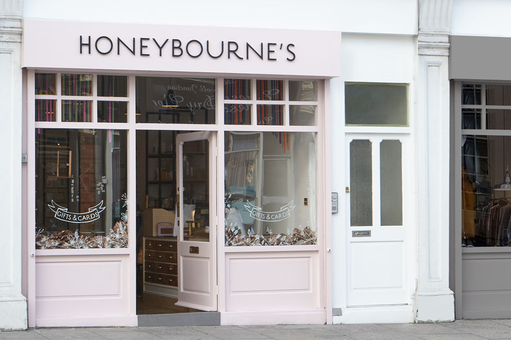
Honeybourne’s is a newly formed gift shop and homeware brand with a flagship store in South East London. RYE Design was engaged to develop the company’s visual identity including a new logo, signage, packaging, and website design. Key elements of the new visual identity include the company’s signature teal colour coupled with neutral tones that complement the materiality of the shop’s interiors. Concurrently RYE Design was also commissioned to complete the interior design of Honeybourne's inaugural flagship store to coincide with their online shop. The simultaneous culmination of both projects contributed to the creation of a holistic brand identity.
THE SCHEME
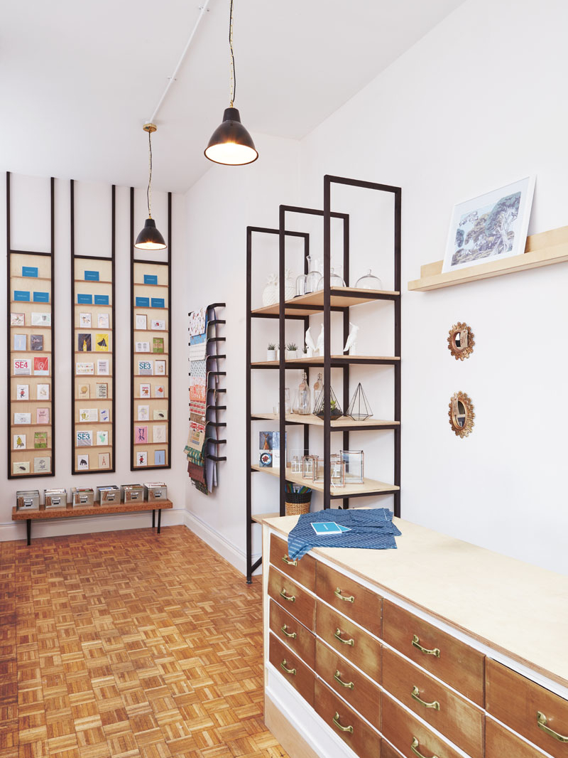
Internally the materials palette for the flagship store and design detailing were decidedly minimal given the breadth and variety of different products being merchandised within the space. Birch plywood shelving suspended between blackened hardwood frames accentuated the double height shop floor and framed the products on offer. The original hardwood parquet flooring within the unit was retained in an effort to minimise the environmental impact of the fit-out. This was re-finished to a honey tone to match the reclaimed drawer fronts used to clad the point of sale counter. We decided to consistently use vintage brass metal detailing throughout the scheme. This created a visual consistency from the shops pink exterior to the muted interior palette and sharply contrasted the teal packaging colours drawing together the various elements of the design.